I've featured this before, but it's worth another look.
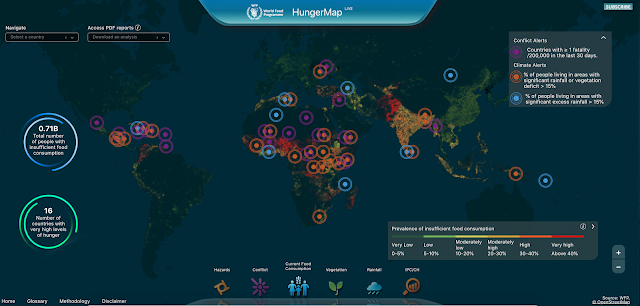
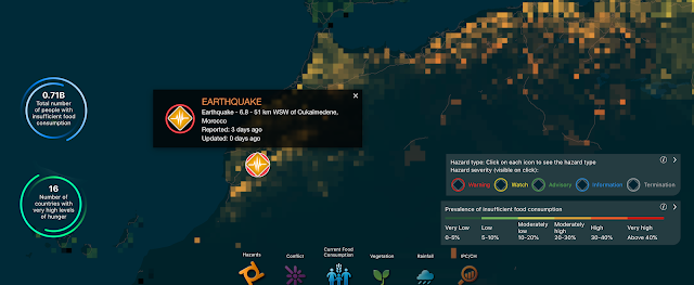
🌎 Geography teachers here is a brilliant map https://t.co/VL1sbJ3Ytb by @WFP it shows food consumption, conflicts and natural hazards live that you can use in your classrooms.
— Charlie Jordan (@MINIJ0RDY) September 12, 2023
A range of data which is dramatically presented and makes a vivid impression.


