Plenty of GIS related stories here... I've been saving a few of the stories, and collated a Google Document….
Friday, August 05, 2016
Google virtual Favela tour
Google has been working in the favelas of Brazil to produce a virtual fieldtrip experience which, with the Olympics about to start in earnest (some events have already started) is well worth taking a look at. Thanks to Ben Hennig for the tipoff to this resource.

Favelas are being mapped because "a big part of having an identity is having an atlas".
They are not just a place, they are a people, and to fully understand them, you must go inside...
This is colourful and is well worth experiencing (make sure that you wear your headphones when you do)

Favelas are being mapped because "a big part of having an identity is having an atlas".
They are not just a place, they are a people, and to fully understand them, you must go inside...
This is colourful and is well worth experiencing (make sure that you wear your headphones when you do)
Saturday, July 02, 2016
Saturday, June 25, 2016
Brexit cartogram
It was good to spend time with Ben Hennig at the GIS Day that we hosted at my school on Tuesday.
I was expecting Ben to produce a map of the referendum results and he has delivered as expected.
He describes the map as follows:
The following map is a cartogram that shows the electoral areas from this referendum resized according to their total number of people entitled to vote. In addition, the vote share for leaving and remaining is shown in differently shaded densities, using blue for the remain votes and red for the leave votes (which complement each other to 100% of the valid votes)

Image created by Ben Hennig and shared under CC license - click for a bigger version
GI Learner
GI Learner

I am involved in this project which has been funded by ERASMUS+ for the next three years.
I will be researching and producing resources on the theme of GI in schools.
The first resources I am creating are on the theme of the LOCAL for K7
Check out the GI Learner website
Follow the Twitter feed for the project.
Sunday, May 29, 2016
Saturday, May 07, 2016
Early bird still open for Practical Pedagogies 2016

Russel Tarr has pulled together another excellent programme of events which will take place in the first week of November, and this time I can make it. In fact I'm already booked for my flights, and my colleague Claire is coming along too, which is a bonus!
Just got to sort my accommodation now.
I will be presenting at Practical Pedagogies 2016.
EARLY BIRD BOOKINGS ARE NOW AVAILABLE
The full programme is HERE.
My session is called 'The Power of Geographical Information', and is described below:
The Power of
‘Where’: Geographical Information in the curriculum
Geography is an academically robust subject which spans the social and
physical sciences and promotes a lifelong interest and fascination in how the
world works.
Nicholas Crane, President of
the Royal Geographical Society
Abstract
Geographers are interested in spatial
patterns, and the growing availability of, often real-time, location based information
brings new depth to teaching geography. Students don’t only consume this
information, but they also produce it themselves, and it is also used after
natural disasters to aid the relief effort.
The workshop will explore how this renewed
focus on the ‘where’ can bring new ideas to teach familiar topics, but also
broaden these activities into other curriculum areas. It will include ideas
from several ERASMUS-funded projects, a resource on transport geographies, a
project for the British Red Cross and work completed in the classroom by
pupils.
So there'll be plenty on digital mapping and its use in the classroom.
So there'll be plenty on digital mapping and its use in the classroom.
You’ll leave the session with some
practical pedagogical resources to adopt and adapt, and ideas for personal
innovation, as well as introducing some free tools and mobile apps.
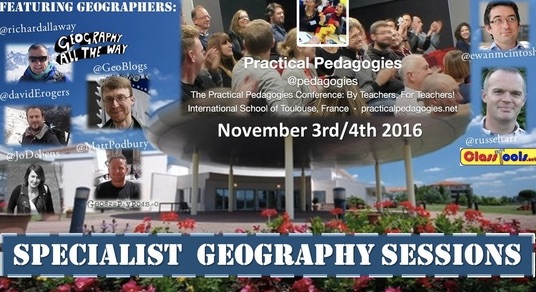
Matt Podbury has shared some of the other Geography names who will be presenting at the event over on his fine GeographyPods site.
See you there?
Thursday, May 05, 2016
New updated Mapstream page

A few years ago now, I wrote a whole suite of lessons for Edina's MapStream for Schools service. For those who don't know what this is, it's a streaming service for the Ordnance Survey's mapping. Unlike Digimap for Schools, which has a set of tools that come with it, this provides a stream of the maps themselves, which can then be visualised by another GIS tool, such as QGIS.
Check out the updated website… and the resources… and MapStream….

Sunday, December 27, 2015
Sunday, December 13, 2015
Luminocity3D Urban Map
This amazing map was launched this week and will be of tremendous value to anyone who is exploring the changing size of urban spaces over the years. This means anyone studying GCSE or the current (and new) 'A' level Geography specifications.
It uses the same engine as Luminocity 3D, which I've blogged about previously….
Click on cities to see their growth over time.

It uses the same engine as Luminocity 3D, which I've blogged about previously….
Click on cities to see their growth over time.

Wednesday, October 14, 2015
New features on Digimap for Schools endorsed by...er... me
A couple of new additions to the growing list of features for subscribers to Digimap for Schools.
From the EDINA blog...
The 1950s mapping fill in the mid point time period between the 1890s and current OS mapping. The 1950s mapping are perfect for comparing changes over time and exploring the landscape, urban areas, road network and other features of post-war Britain.
We’ve made a small tweak to the interface to enable the selection of any two time periods, using the buttons and the slider (shown below) you can choose whether to view 1890s, 1950s or mapping from today, and any combination of two maps.

When a decade button is blue, click it to toggle it off and switch on the other map. You can watch a demo video on the Digimap for Schools YouTube Channel
The 1950s mapping is lovely to look at and a wonderful addition to the mapping available in Digimap for Schools. The maps have been provided by the National Library of Scotland.
The other great feature we’ve added, is the ability to add a text box to your map. Until now, users have only been able to add short text labels which is a bit restrictive when you want to write a longer piece of information to annotate the map.
The Text Box tool can be found in the Annotations Toolbar in a sub-menu of the Label tool.

Click to activate the tool and click on your map to add the Text Box. Then simply click in the box to start typing. Resize the box to display as much text as you like!
There's also a quote from a user of the service...
"This new map layer offers scope for further historical comparisons of local areas, and the impact of more recent changes than the previous 1890s addition.
From the EDINA blog...
Today the Digimap for Schools team release two new wonderful features – 1950s OS historic mapping and a text box tool.
We’ve made a small tweak to the interface to enable the selection of any two time periods, using the buttons and the slider (shown below) you can choose whether to view 1890s, 1950s or mapping from today, and any combination of two maps.
When a decade button is blue, click it to toggle it off and switch on the other map. You can watch a demo video on the Digimap for Schools YouTube Channel
The 1950s mapping is lovely to look at and a wonderful addition to the mapping available in Digimap for Schools. The maps have been provided by the National Library of Scotland.
The other great feature we’ve added, is the ability to add a text box to your map. Until now, users have only been able to add short text labels which is a bit restrictive when you want to write a longer piece of information to annotate the map.
The Text Box tool can be found in the Annotations Toolbar in a sub-menu of the Label tool.
Click to activate the tool and click on your map to add the Text Box. Then simply click in the box to start typing. Resize the box to display as much text as you like!
"This new map layer offers scope for further historical comparisons of local areas, and the impact of more recent changes than the previous 1890s addition.
I traced the railway network that used to pass through my village before Beeching's cuts, and looked for clues of the many farms that now lie beneath the urban sprawl of Milton Keynes. I traced the transformation of the Isle of Dogs, and the steady infill of housing in small villages.
The new maps are the latest in the continued improvements that are being made to this essential tool for the Geography department"
Alan Parkinson, Head of Geography at King’s Ely (Junior) School
Wednesday, October 07, 2015
Sad topographies
Via Twitter, I love this set of snapshots from Google Maps (?)
Depressing place names snipped out of the map and taken out of context.

Also reminds me of a tweet from last night of this location.
How about a set of happy places, or toponyms, or people's names, or .....
Depressing place names snipped out of the map and taken out of context.

Also reminds me of a tweet from last night of this location.
How about a set of happy places, or toponyms, or people's names, or .....
Sunday, October 04, 2015
New video on basemaps in ArcGIS Online from the ESRI UK Ed team
Basemaps video from Esri UK Ed Team on Vimeo.
Demo showing some of the base maps available in ArcGIS Online
Subscribe to:
Posts (Atom)